...

.Web Design Agency

ux / ui / conversion

We design digital experiences that connect brand, usability, and business goals instead of treating them as separate layers.

Service focus

conversion-focused web designux designlanding page design

selected clients

Trusted by global and regional brands.

way.foodway.food website preview
Tamplen Plastic SurgeryTamplen Plastic Surgery website preview
Hübner GroupHübner Group website preview
cale designcale design website preview
ICEMÄNNERICEMÄNNER website preview
LOZLOZ website preview

Overview

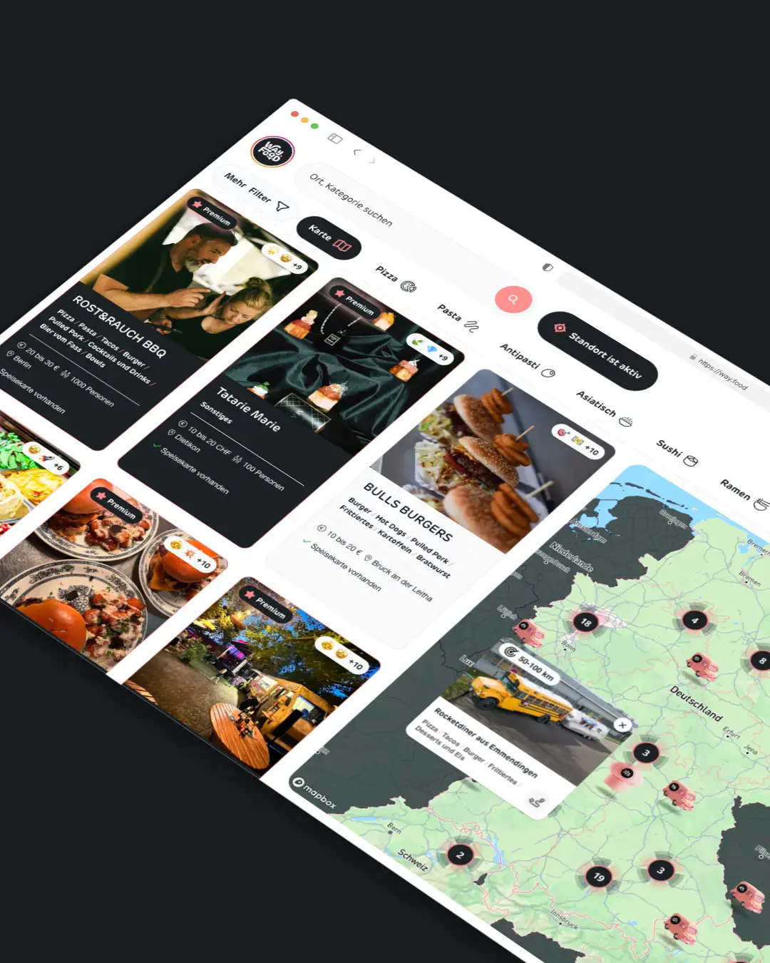
Web design that earns attention and trust

Good web design is not decoration layered on top of strategy. It is the way structure, hierarchy, brand expression, and interaction work together so users understand what matters and what to do next.

Beyond pretty screens

We design websites and interfaces that should not only look distinctive but also communicate clearly. That means balancing visual identity with readability, calls to action, performance constraints, and the realities of implementation.

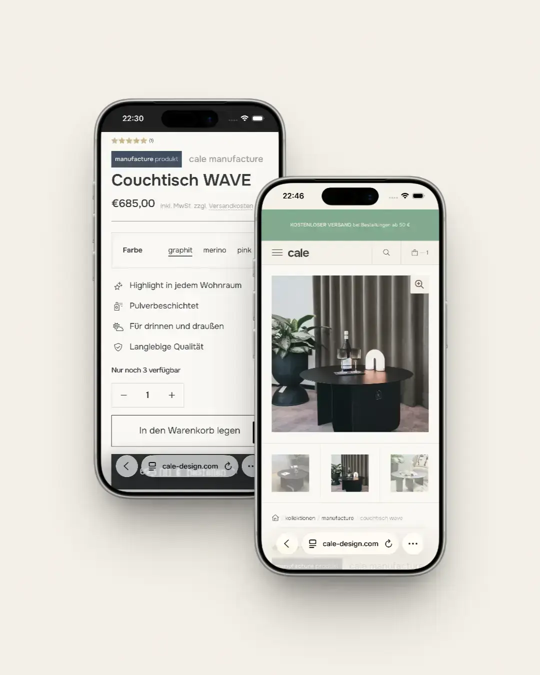
Close to development from the start

Because we work across design and implementation, we design with real breakpoints, content behavior, and technical detail in mind. That reduces the usual gap between concept and final build.

way.food — Foodtruck & Catering Comparison Portal

Process

Foodtruck & Catering Comparison Portal

.Relevant project example

We stay with you from discovery through launch, keeping UX, content, and engineering in one thread so decisions stay traceable. The spotlight project shows how we turn goals into a shippable product without trading away speed or maintainability. If your roadmap looks similar, the same rhythm usually applies: clarify, build, measure, and iterate.

  • Clarify positioning and primary actions
  • Structure the journey and page intent
  • Translate brand into a digital system
  • Design key templates and component behavior
  • Review implementation details with engineering
  • Tighten conversion paths after first real content is live

View case study

way.food — Foodtruck & Catering Comparison Portal

Web design only works when build constraints and goals stay connected.

screen-only design

Optimizes for screenshots instead of real content states.
Hands off layouts without technical constraints.
Treats brand and UX as separate layers.

unlimited.studio

Designs hierarchy, readability, and conversion paths from the start.
Designs with breakpoints, performance budgets, and feasibility in mind.
Connects positioning, user flows, and visual language as one system.

Related case studies

View all case studies

Frequently asked questions

Figma is part of the workflow, but the real value is the thinking behind hierarchy, clarity, and conversion.

Yes. We often design and develop in one connected workflow.

Yes. Many projects start with a UX and visual redesign before the technical rebuild.

We design scan patterns, module rhythm, and progressive disclosure so long pages stay usable.

Yes. We design to WCAG 2.2 AA by default: 4.5:1 contrast on body text, 3:1 on large text and UI elements, visible focus states, keyboard navigation across interactive components, and semantic landmarks. Motion respects prefers-reduced-motion, and forms include clear error states with labeled inputs.

Figma files with auto-layout components, documented states (default, hover, focus, active, loading, empty, error), responsive breakpoints at 375, 768, 1024, and 1440, spacing and type tokens, and a written behavior spec for anything dynamic—animations, transitions, conditional visibility.

Website glossary

Terms we use when shaping interfaces people actually finish.

Visual hierarchy

Deliberate emphasis guides attention so primary actions and proof points read before secondary detail.

Information scent

Labels, previews, and navigation cues help users predict what they will find before they click.

Responsive density

Layouts adapt spacing, typography scale, and component density so content stays readable on every breakpoint.

Interaction states

Hover, focus, loading, empty, and error states prevent ambiguity and reduce support friction.

Message match

The page headline and primary CTA align with the promise that brought the user there.

Design system thinking

Reusable components and rules keep new pages consistent without reinventing patterns each time.

Have a project in mind? We'd love to hear about it. Drop us a line and let's create something extraordinary together.

Contact us

600 characters left

This site is protected by reCAPTCHA and the Google Privacy Policy and Terms of Service apply.

Kassel, Germany.

()

© 2026 unlimited.studio.designed with in kassel, germany.